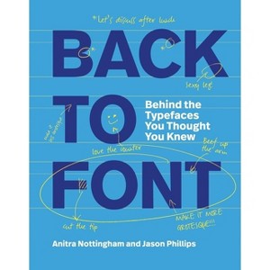
Back to Font - by Anitra Nottingham (Paperback)
$14.44 MSRP $25.00
In Stock
Free & easy returns
Return this item by mail or in store within 90 days for a full refund.
Eligible for registries and wish lists
About this item
Additional product information and recommendations
Discover more options
- $23.30MSRP $25.00Buy 2, get 1 free select music, books & more
- $58.83MSRP $85.00Buy 2, get 1 free select music, books & more
- $23.49MSRP $42.00Buy 2, get 1 free select music, books & more
- $20.52was $24.00 New lower priceBuy 2, get 1 free select music, books & more
- $18.63MSRP $19.99Buy 2, get 1 free select music, books & more
- $24.29 - $24.80MSRP $30.00Buy 2, get 1 free select music, books & more
- $8.00Buy 2, get 1 free select music, books & more
- $14.81Buy 2, get 1 free select music, books & more5 out of 5 stars with 1 ratings
- $14.39MSRP $21.99Buy 2, get 1 free select music, books & more
- $11.19MSRP $19.99Buy 2, get 1 free select music, books & more
- $33.56Buy 2, get 1 free select music, books & more
- $19.35MSRP $24.99Buy 2, get 1 free select music, books & more
- $16.77MSRP $17.99Buy 2, get 1 free select music, books & more
- $18.03MSRP $28.99Buy 2, get 1 free select music, books & more
- $17.19MSRP $19.99Buy 2, get 1 free select music, books & more
- $28.38MSRP $50.00Buy 2, get 1 free select music, books & more
- $15.83MSRP $24.99Buy 2, get 1 free select music, books & more
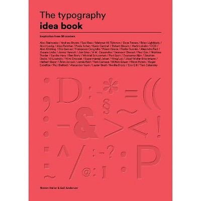
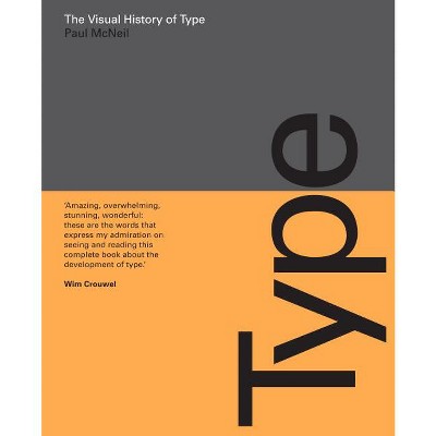
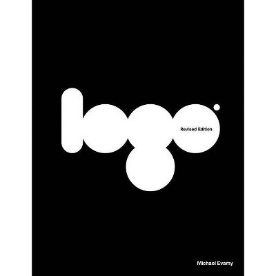
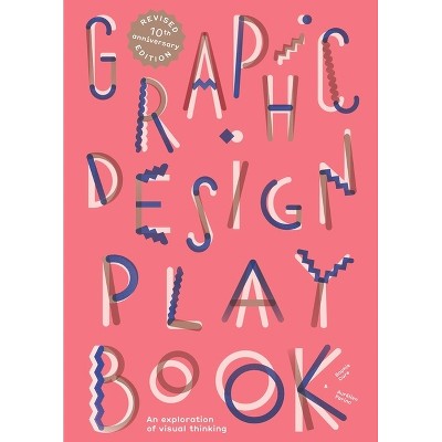
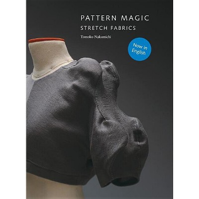
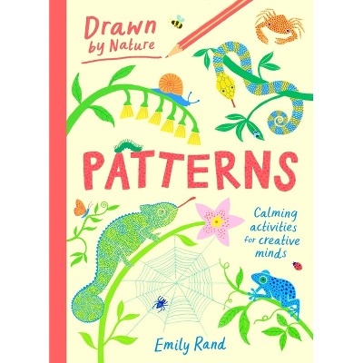
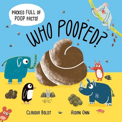


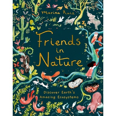
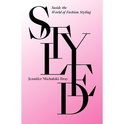
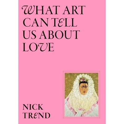
Frequently bought together
- $200.00Buy 2, get 1 free select music, books & more
- $15.83MSRP $16.99Buy 2, get 1 free select music, books & more
- $10.40MSRP $12.97Buy 2, get 1 free select music, books & more
- Highly rated$59.22MSRP $95.00Buy 2, get 1 free select music, books & more5 out of 5 stars with 3 ratings
- $19.95Buy 2, get 1 free select music, books & more
- $11.01MSRP $12.95Buy 2, get 1 free select music, books & more
- $31.95Buy 2, get 1 free select music, books & more
- $11.36MSRP $19.99Buy 2, get 1 free select music, books & more
- $25.32MSRP $75.00Buy 2, get 1 free select music, books & more
- $29.10MSRP $40.00Buy 2, get 1 free select music, books & more
- $31.49MSRP $60.00Buy 2, get 1 free select music, books & more5 out of 5 stars with 2 ratings
- $79.22MSRP $85.00Buy 2, get 1 free select music, books & more
- $20.84MSRP $21.95Buy 2, get 1 free select music, books & more
- $9.63MSRP $12.00Buy 2, get 1 free select music, books & more
- $12.33MSRP $19.99Buy 2, get 1 free select music, books & more
- $29.99 - $95.99Buy 2, get 1 free select music, books & more
- $8.99 - $19.24Buy 2, get 1 free select music, books & more


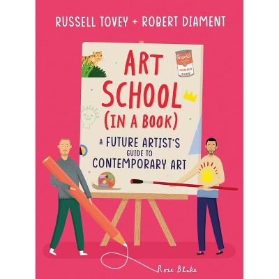
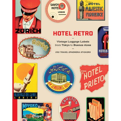
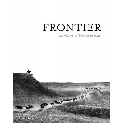
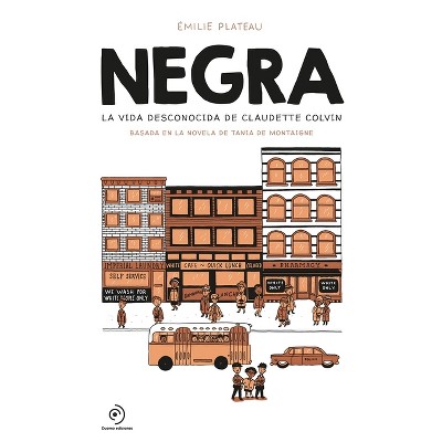
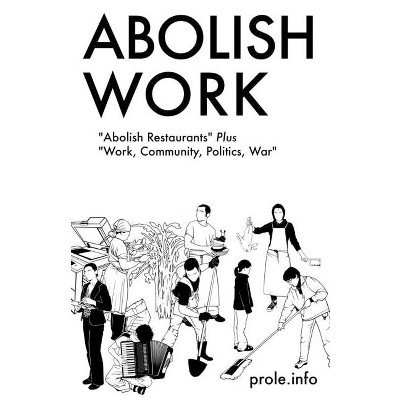
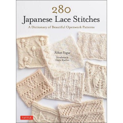

Best-selling Art, Photography & Design Books
- $38.48was $49.95 New lower priceBuy 2, get 1 free select music, books & more4.3 out of 5 stars with 6 ratings
- $13.97MSRP $24.99Buy 2, get 1 free select music, books & more4 out of 5 stars with 24 ratings
- $8.98MSRP $14.99Buy 2, get 1 free select music, books & more3.3 out of 5 stars with 45 ratings
- $89.95MSRP $125.00Buy 2, get 1 free select music, books & more4.2 out of 5 stars with 23 ratings
- $34.40MSRP $40.00Buy 2, get 1 free select music, books & more4.8 out of 5 stars with 45 ratings
- $25.16was $37.27 New lower priceBuy 2, get 1 free select music, books & more2.3 out of 5 stars with 3 ratings
- $13.99Buy 2, get 1 free select music, books & more3 out of 5 stars with 2 ratings
- $11.00MSRP $16.95Buy 2, get 1 free select music, books & more4.3 out of 5 stars with 6 ratings
- $38.49Buy 2, get 1 free select music, books & more
- $28.04Buy 2, get 1 free select music, books & more5 out of 5 stars with 2 ratings
- $45.70MSRP $80.00Buy 2, get 1 free select music, books & more5 out of 5 stars with 9 ratings
- $27.24MSRP $45.00Buy 2, get 1 free select music, books & more4.6 out of 5 stars with 11 ratings
- $12.99Buy 2, get 1 free select music, books & more5 out of 5 stars with 2 ratings
- $86.03was $111.87 New lower priceBuy 2, get 1 free select music, books & more4.8 out of 5 stars with 41 ratings
- $90.31MSRP $150.00Buy 2, get 1 free select music, books & more4.9 out of 5 stars with 32 ratings
- $25.16Buy 2, get 1 free select music, books & more4.6 out of 5 stars with 10 ratings
- $38.99MSRP $40.00Buy 2, get 1 free select music, books & more
- $40.43was $50.00 New lower priceBuy 2, get 1 free select music, books & more5 out of 5 stars with 1 ratings
- $19.82MSRP $30.00Buy 2, get 1 free select music, books & more
- $45.99MSRP $80.00Buy 2, get 1 free select music, books & more
- $25.99MSRP $45.00Buy 2, get 1 free select music, books & more1.4 out of 5 stars with 23 ratings
- Highly rated$13.79MSRP $23.99Buy 2, get 1 free select music, books & more5 out of 5 stars with 3 ratings
- $45.29MSRP $60.00Buy 2, get 1 free select music, books & more4.6 out of 5 stars with 9 ratings